
Pack artwork has to do several jobs in a very narrow space. It identifies the game, names the set, makes room for product information, and still needs an image that can catch the eye. Looking at a few packs side by side is a good way to see how those jobs are arranged.
The six images below come from three eras already represented in the local archive: Original Series, Neo, and Scarlet & Violet. This is a small visual comparison, not a complete history of the packaging. The point is to look carefully at what is actually visible.
Start with the title, not the character
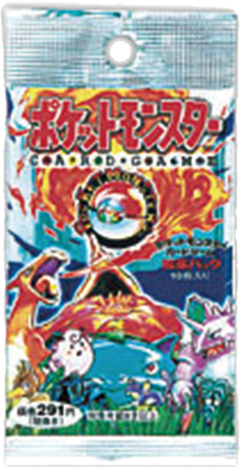
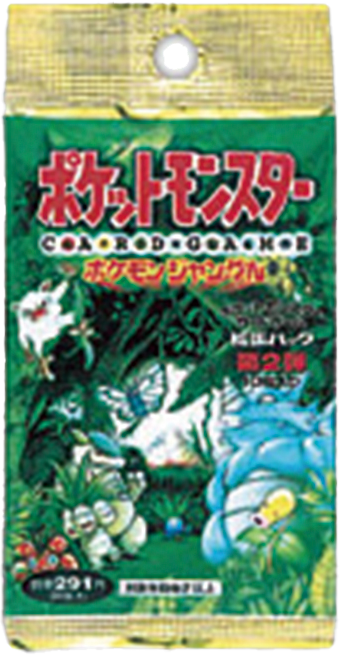
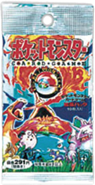
On the first-expansion and Pokémon Jungle packs, a large red Japanese wordmark dominates the upper part of the illustration. The smaller “CARD GAME” lettering sits directly beneath it. The characters and scenery fill the space below, so the title feels like a sign over an illustrated world.
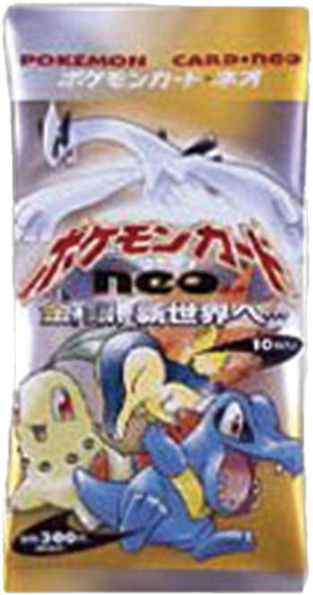
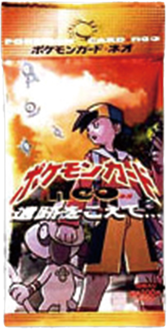
The two Neo images move the main logo toward the middle. On the first pack, a pale winged figure occupies the upper area while three smaller Pokémon gather at the bottom. The logo becomes a dividing line between those two groups. The second Neo image keeps that central title placement but changes the scene dramatically: orange light, a prominent human figure on the right, and another figure close to the lower edge.
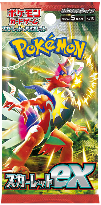
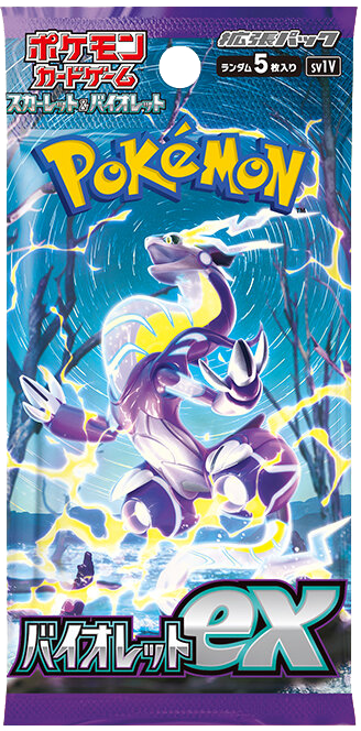
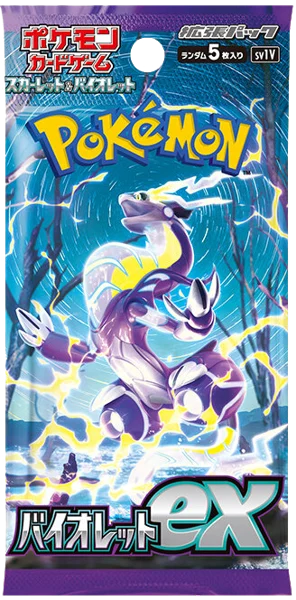
Scarlet ex and Violet ex organize the space differently again. A large yellow-and-blue Pokémon logo sits high in the image, while the set title and oversized “ex” anchor the bottom. Between them, one main character takes most of the available room. The image is less a gathering of equal-sized subjects and more an introduction to a single figure.
Look at what holds the scene together
Pokémon Jungle is especially clear at thumbnail size. Green foliage connects the different characters into one setting. Even when the small details are difficult to read, the pack still looks like a place.
The Neo examples show how much can change without abandoning a shared logo arrangement. The first combines pale upper space with a group along the bottom; the second leans on warm orange light and a more vertical scene. A common title position does not require the artwork beneath it to tell the same kind of story.
The Scarlet and Violet images are easier to compare as a coordinated pair. Their logo and set-name positions closely match, but Koraidon's red body and the greener setting contrast with Miraidon's violet body, blue curves, and yellow lightning. The shared frame makes those differences more noticeable.
Keep the image file in the comparison
The older files are visibly softer than the modern images. That limits any judgment about tiny lettering, edge sharpness, or surface detail. A fuzzy archive image is not evidence of fuzzy printing, and the bright areas do not establish how a physical wrapper reflects light.
Composition survives those limits better than fine texture. Ask where the title sits, how many figures share the frame, and whether the background reads as a setting or as movement around a character. Those are useful observations even at the scale of a calendar thumbnail.
Open the gallery images for a closer view, then return to the small cards. The difference between those two viewing sizes is part of the pleasure: a pack can work as a quick burst of color and still reward a slower look.